Inked Voices
Redesigning the User Experience to Increase Sign Ups
Problem
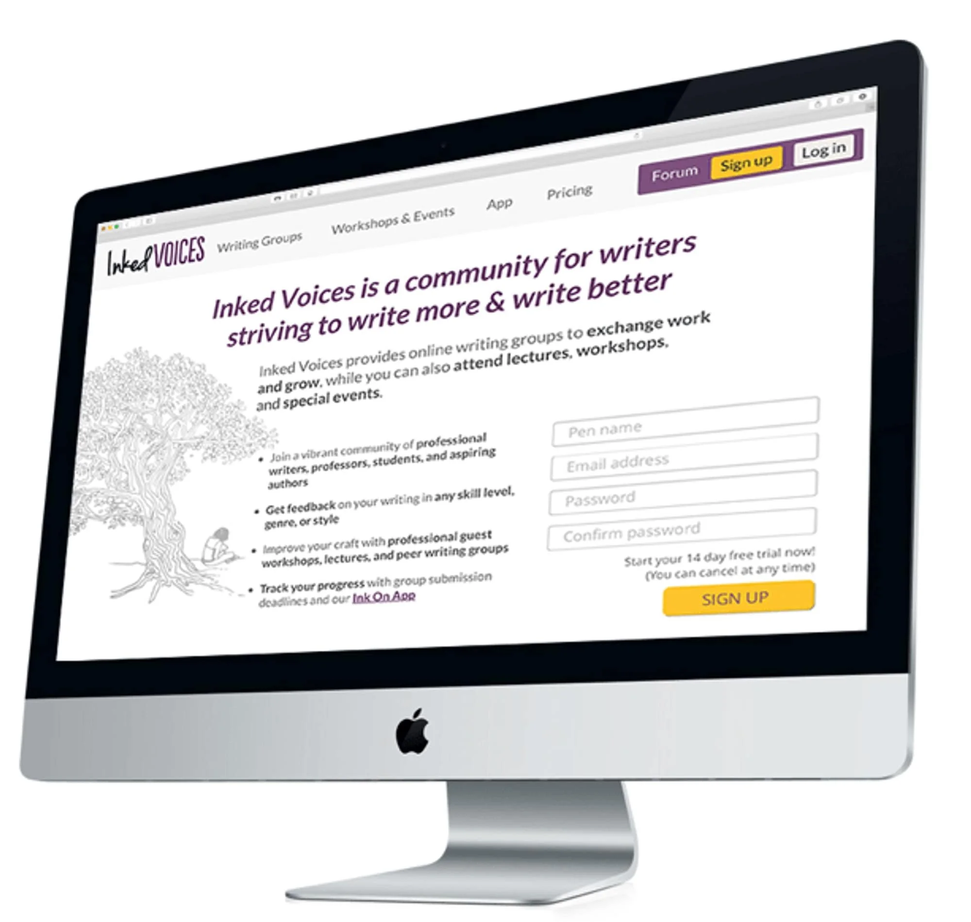
New visitors were not signing up because the website’s text-heavy and confusing layout obscured the site’s value.
Solution
We optimized the content and layout so that the core features and benefits were clearer. In addition we added more sign up spots.
My Role
I focused on content strategy, information architecture, and wireframing to redesign the website and reprioritize the site’s content.
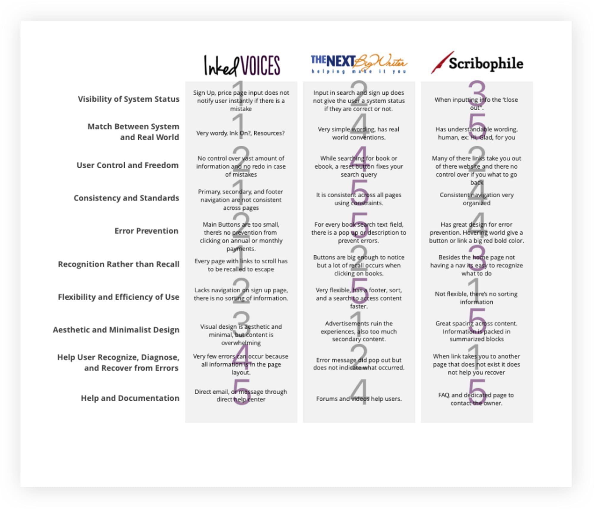
Competitive Research
We looked at similar sites and services to understand how the industry and sites work. In addition we compared features to gain inspiration for our future designs.
Competitive Research
We surveyed and interviewed users to understand their writing group behavior. In addition, we conducted contextual research, watching users use the site and gleaning behavioral insights.
Using the research, we distilled patterns and insights by making an affinity map and identified various user personas, including the one we would design for — the one most likely to sign up for a subscription.
Content Strategy
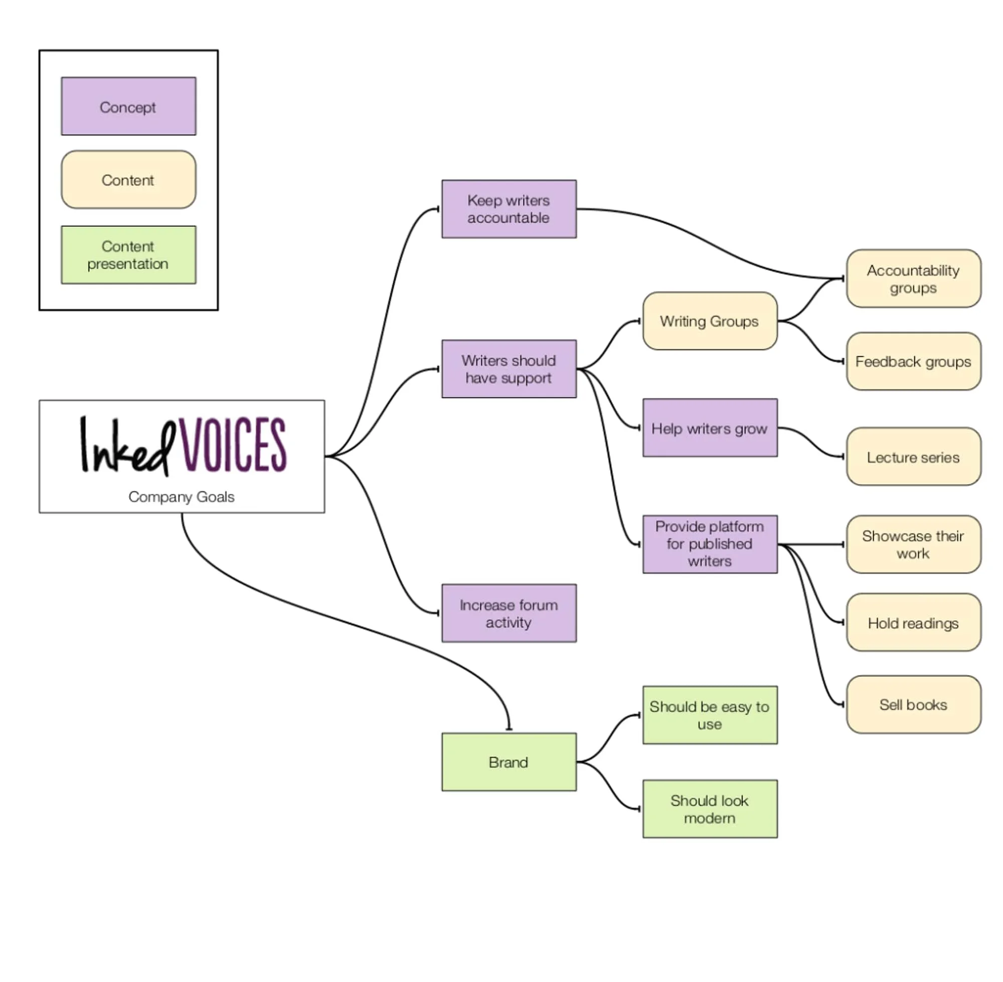
Our research indicated users were overwhelmed with the site’s text content. With our client, we created a content strategy and removed unnecessary or irrelevant content.
Card Sorting & Information Architecture
To understand how to structure the site, we had users card-sort site content, to understand how they categorized information. In contrast to traditional paper card sorting, I used Grafio, an iPad app that sped up the process considerably.
Site Map
From the card sorting results, we created a new, simpler, and more intuitive navigation structure for the site. In addition, the site flow changed somewhat to encourage user signups.
Prototyping, Testing, and Iterating
We started designing first by sketching multiple low fidelity wireframes to get the overall layout. Next, we started testing out our medium fidelity wireframes on users to see if functionality was clear before creating the higher fidelity mockups to send to the client.
Design Results
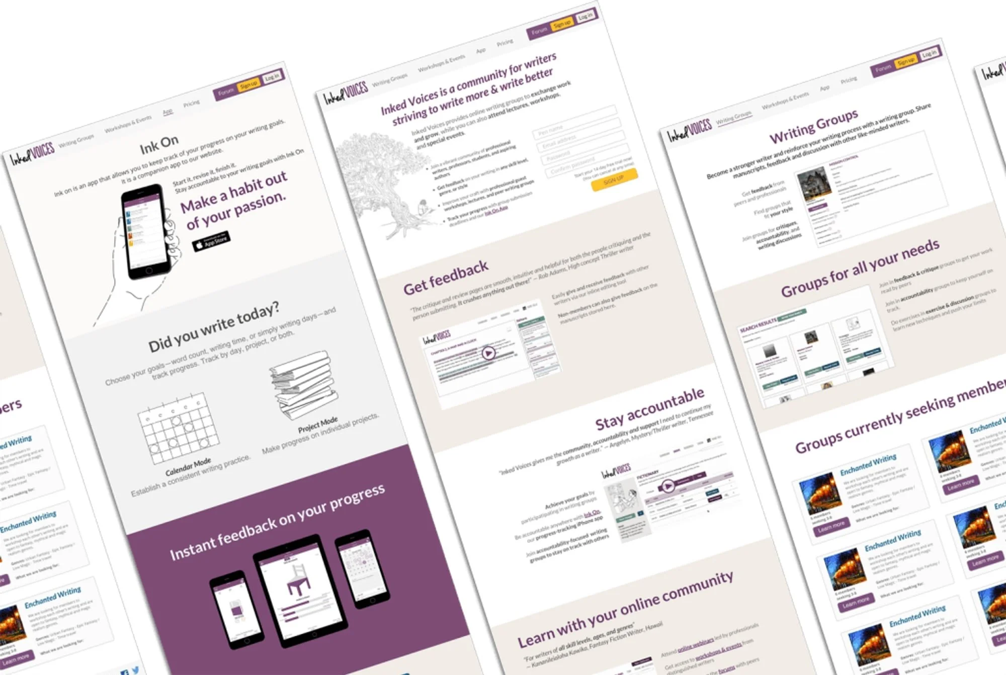
We presented our designs and deliverables to the client who was very happy with the changes. Check out our slide deck to see our presentation. Most of the designs have since been implemented on the site: www.inkedvoices.com.


