Keeping Standards
Designing a Brand Hub & Asset Templates
Background
I worked on this project at Morgan Stanley while on the digital strategy UX team which focuses on our corporate site: morganstanley.com. The project itself lasted several months from start to finish because we had many projects going on at the same time. My team consisted of four UX designers, including myself, and we worked on most parts of the project, although I took the lead in information architecture. In addition, we worked with teams that regularly worked with brand-related assets, namely the Creative Services team, and the Brand Marketing team.
The project itself came about when we were creating standard design templates of assets and web pages for use by our company’s various design teams. While looking into what processes and templates already existed, the extent of the discrepancies between various style guides and standards became apparent, and we decided to increase the scope of our project to include restructuring the way we collaborate between teams on matters of design.
Initial Problem
The main, and initial problem that led to this project was that Morgan Stanley, as a large multinational company with many sub brands, had multiple webpages with overlapping, slightly different, and generally messy style guidelines. In addition, assets were often located in a variety of these webpages or not present on all. Retrieving these assets was a difficult task. Because of this, we needed a single global styleguide and asset repository. We discovered related problems along the way of our research, and tailored our styleguide solution along the way to solve the problem not only by delivering a solution, but by changing how our teams worked with each other and amongst themselves.
Research
Our initial thought we sought to validate was to create a unified Brand Hub that contained our digital style guide and assets. However, we did research to better understand what related problems there were and if we could solve multiple problems at once, as well as create a business case for what would probably be a larger long-term project.
Stakeholder Analysis
Many people from various parts of the firm would be affected by this project, so we sought to understand the stakeholders. We spoke with teams from other Morgan Stanley subbrands, who told us they liked the idea of a unified styleguide, but would require their own special styleguide for elements in their branding that differed somewhat from the parent brand. We spoke with different teams in our department, such as creative services, and brand marketing, who were also on board with the project, and whom we decided to involve more regularly and check in with in our project.
Existing Solutions
First we took a look at what we had. At the time, just on our team, we had two websites: a hand-coded digital styleguide that the creative director coded several years earlier, and a larger marketing website that contained styles, colors, imagery guidelines, but also non-web-related material like merchandise branding. In addition, many assets were distributed among various platforms the access to which a handful of individuals knew, meaning people would always have to ask them for access.
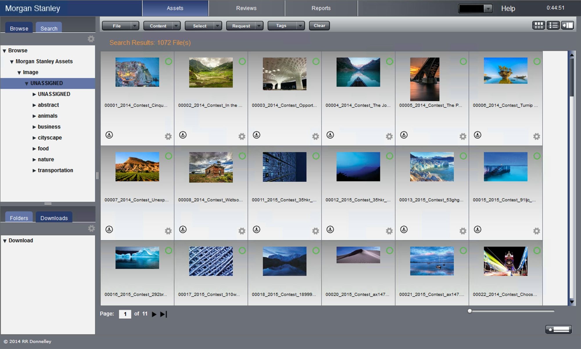
One of our original media storage platforms stored images in various folders, most of which were not fully filled so that the majority of images existed in the “UNASSIGNED” folder.
Understanding the Problem
After holding discussions and meeting with the various teams, we started to understand the core problems affecting our company. We discovered that the problems revolved primarily around two points:
1. Too Many Standards
Our company, being large with multiple sub-brands, had multiple unofficial or outdated guides that made keeping a coherent brand difficult. Development teams existed for each teams and often multiple UI elements had many variations that differed very slightly but noticeably.
2. Inefficient Asset-related processes
Different assets were stored in various locations and with different users and our sharing process was convoluted. Users would often need to go through multiple people, emails, and systems in order to retrieve the correct (and hopefully, up-to-date) asset. Besides this, sharing our brand style with outside agencies we hire for projects has been a problem due to firm security preventing outside entities from easily accessing our internal pages.
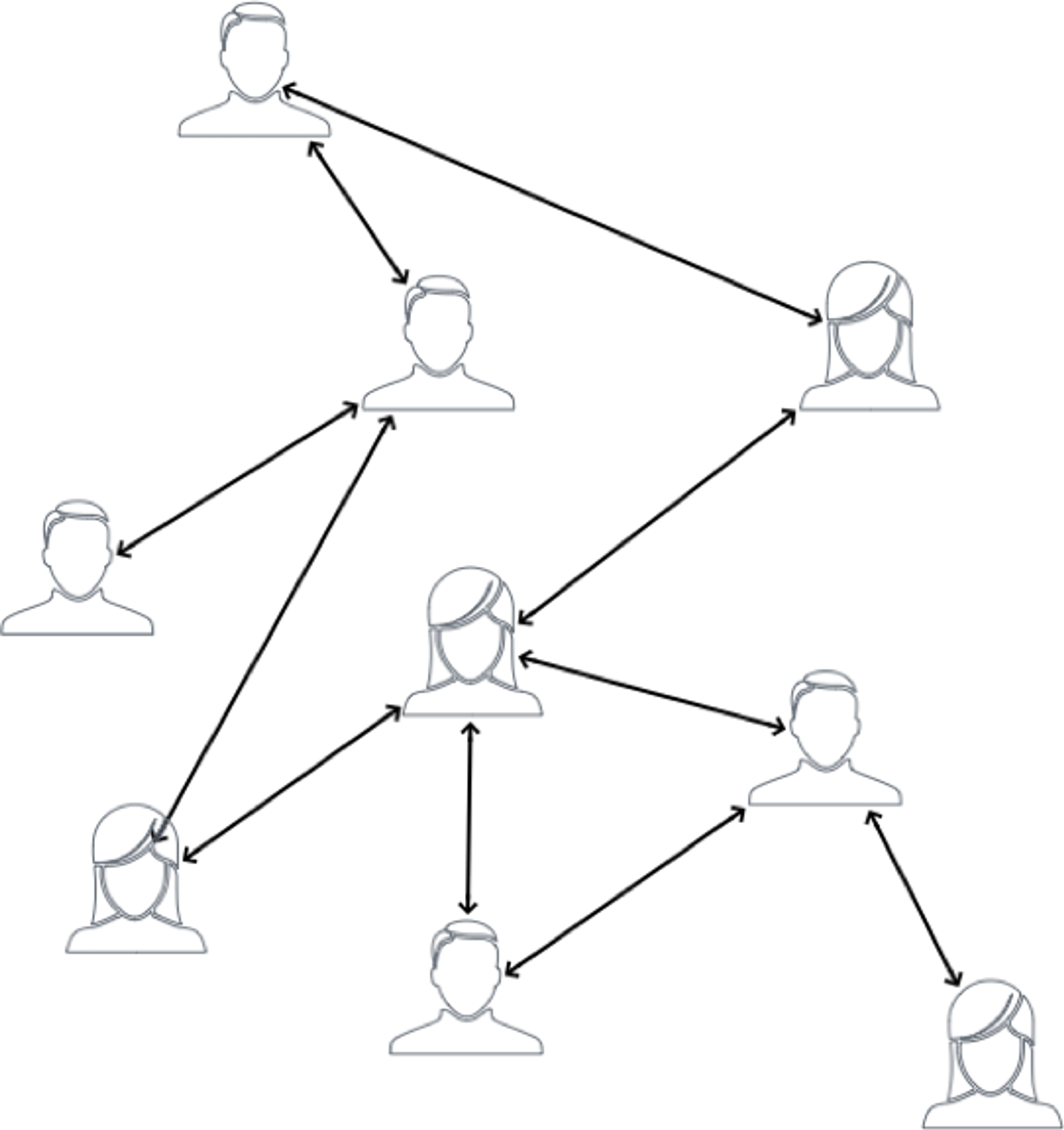
The structure of asset-sharing within the broader team was not centralized, meaning one often needed to go through multiple people in an email chain to acquire the necessary assets.
Solutions & Requirements
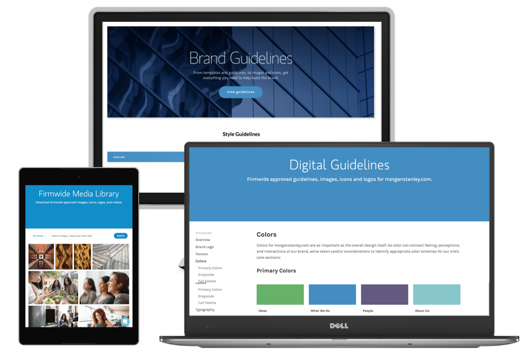
This research validated our creative director’s prior idea to bring in Frontify, which is a brand and asset management platform. We set up weekly meetings with a Frontify representative and had them help us set up our enterprise account and make custom changes according to our designs. Meanwhile we continued to create our templates, gather assets, and input them into the style guide.
The frontify platform helped us set up a brand hub with sub brand sections as per my site architecture. Each brand has its own brand-specific asset library, as well as style guides. Single-sign on allows firm users to be logged in, while Frontify’s permissions allows or restricts access for users based on their role and the brand they work in. However, the global style guide and asset library is accessible to all.
1. A Standard, Shareable Brand Hub
Our hub would contain a standardized guideline for our company, as well as derivative (but not duplicate) style guides for our company’s various sub-brands. This would be easily shareable within the firm through single sign-on, and would also be shareable outside of the firm to help outside agencies understand our brand when doing projects for us.
2. Create/Update Assets & System
We would sort, categorize, tag, and store our assets on the new Brand Hub asset library, using it as a central repository and Single Source of Truth. This way, the most updated assets and files would be on the repository and we could avoid older, outdated files being shared. When someone requires an asset, he/she can access the file from the Brand Hub instead of asking someone else and waiting for a reply.
With a brand hub, all assets, templates, and style guides would be stored in a centralized location, in a hub and spoke style network. Out-of-date assets, or people bottlenecks would no longer be a problem.
Brand Hub Architecture
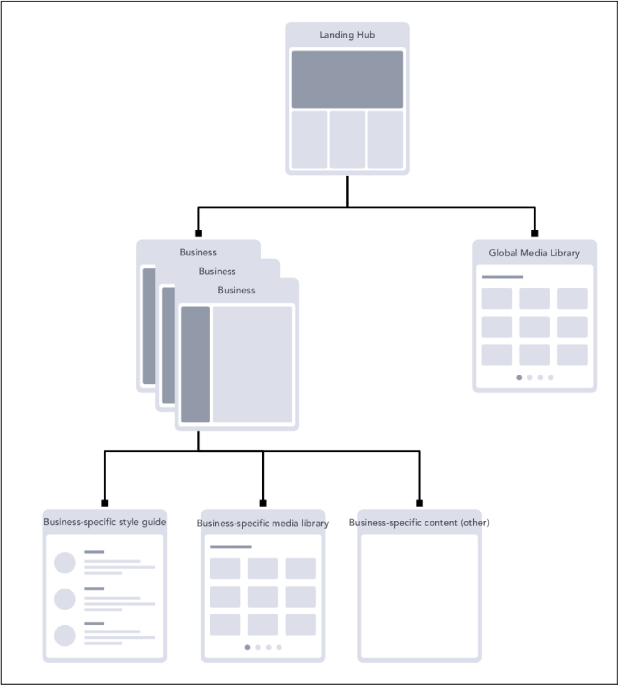
From the understanding of our project goals, I developed the following site map so that the Frontify development team could implement it for us. We would have a single landing page that connected to our company’s various sub-brand businesses, as well as a global media library which would house all firm-wide assets and be accessible to all users regardless of their permissions.
Each sub-brand business would contain their business-specific pages. While our firm would have a global style guide, each business would have a few additional styleguides that did not repeat, but added their brand flairs to our existing styles. This way styles would not be duplicated. In the same way, each business would have a media library and other pages specific to them.
We ended up with a three part distinction within each brand, along with access to the global media library
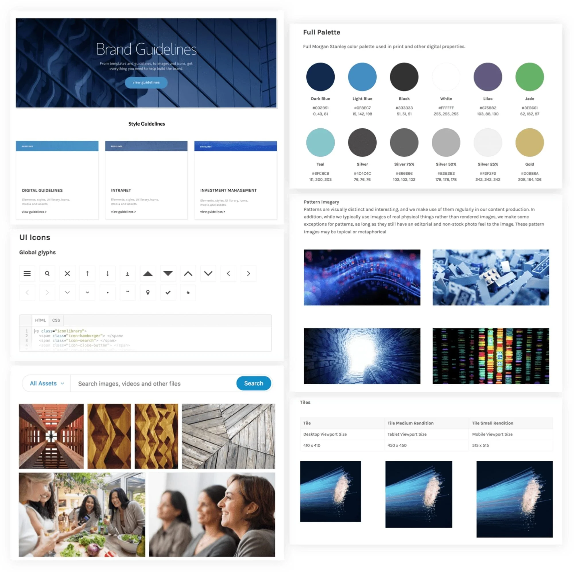
Guidelines: styles, colors, typography, imagery
UI Library: html components like buttons, popouts, text blocks
Assets: templates, fonts, elevator signage, building signage templates
The site map helped us communicate with Frontify our vision for our customized styleguide
Collect, Create, and Categorize
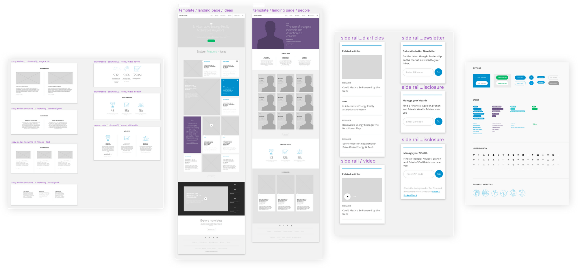
As a team we went through the site collecting representative UI patterns, assets, and other useful elements. We categorized them, mocked them up in Sketch, and decided what patterns to put where in our new Brand Hub.
Atomic Design
We created Sketch Symbols out of these following the principles of Atomic Design: from the smallest color and detail, we created symbols within larger symbols such that a change at the atomic level (e.g. a color, text, icon etc) would populate upwards to larger elements (e.g. a button, navbar, popup box etc).
We created Sketch symbols of common UI patterns and from these Sketch symbols then mockup templates of entire webpages.
Typography Taxonomy
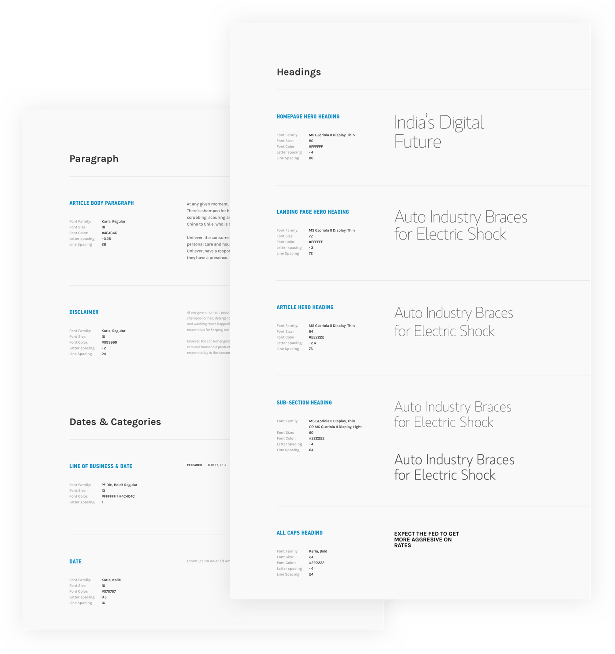
We had many overlapping and idiosyncratic text styles, and so I culled and combined them, resulting in a taxonomy. I originally categorized them by CSS-related attribute (e.g. large, black, capitalized, etc) rather than location or nominal role (e.g. heading, ideas page, date, etc), so they were location-independent. Eventually we decided upon location- and role-based nomenclature for style guides, but attribute-based taxonomy in templates because the latter was easier to navigate.
The most important text styles are shown here along with the attributes and an example of usage.
As someone who likes categorizing things, I took great joy in creating a taxonomy and nomenclature for the various text styles that exist on our site.
Finalized Brand Hub
After we had the assets, we populated the platform, creating and customizing the landing pages, style guides, and asset libraries. We held weekly meetings with Frontify and our other stakeholder teams to keep them updated on the project’s smooth progress and success.
We have finished phase one but will add more features in phase 2. So far, the project has already become a resounding success, increasing inter- and intra-team efficiency and collaboration. We have since finished inputting the various materials, styles, and guidelines, as well as creating the various templates. My team and I have been receiving fewer requests for assets, with people who request them going to the Brand hub instead. A straw poll of other teams showed that people seem to receive fewer such requests and are pretty happy with the new system. In addition, there appears to be buy-in as other teams are now actively consolidating their assets and adding to their style guides. This is a living breathing document and we continue to update our assets when we make changes. In addition, I have recently started to add instructional pdfs on how to use our other platforms on this hub as a way to allow newer designers to be onboarded.

